6 Things to Remember to Create Great PowerPoint Slides
I'm sure you've all been there – at a conference or on a course, only to spend hours staring at PowerPoint slides that are full of text and bullet points. "Why did they bother presenting?" you think. "They could have just sent the slides round and saved us all the trouble."
Hi, we are Happy
We are leading a movement to create happy, empowered and productive workplaces.
How can we help you and your people to find joy in at least 80% of your work?

Fortunately, at Happy, all of our trainers make our courses interactive and the same goes for our conferences, too. We don't use PowerPoint slides in our IT courses, and we make sure that every learner is sat in front of a PC so they can experiment with the software and get involved with exercises. And we try to do the same at our conferences, with lots of time for discussion.
But what about you? How much thought have you put into the slides for your next presentation?
Often, if people miss your talk, they will ask if you can send them a copy of your PowerPoint slides. But actually, good PowerPoint slides should be almost meaningless without you there to narrate them.
Here are six key things for you to remember to create great PowerPoint slides:
- Ditch the PowerPoint altogether. It’s very tempting with a PowerPoint presentation to read off the slide – and the slides can actually be a distraction, as people start reading the text on it rather than listening to you.
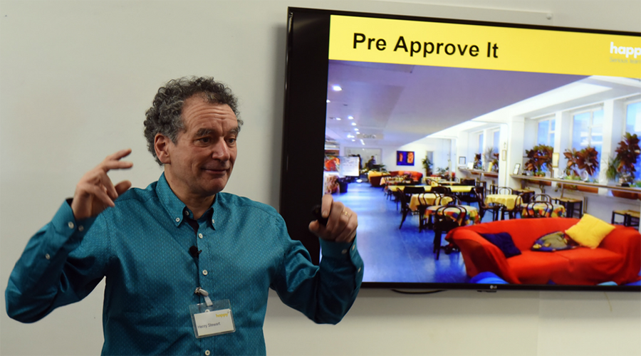
- But, if that’s not an option... think about the real purpose of your slides. They should only be an extra prop to assist you with your presentation – so keep text to a minimum. Our CEO, Henry, has a rule of no more than ten words to a slide, which forces you to really think about what your key point is or a key question to ask the audience. The main part of the slide should be a large, high-quality image (not ClipArt!) or a graph that emphasises the point you are making.
- Limit animations on your slides and between them. People will grow bored if they have to wait too long between each slide, while your images and bullet points zoom around the screen and finally into place. Use simple animations such as ‘wipe left to right’ rather than 'move' or 'fly'.
- Use a consistent template. It looks much more professional if your slides use the same branding, and use fonts and colours that are clear and easy to read. Generally, it is best to keep to no more than two fonts through a presentation, and no more than three different colours (and, please – leave Comic Sans at home). Make sure that the font size is large enough so that it can be seen at the back of the room – at Happy, we use 30pt or larger.
- Unsure if your slide is clear enough, or has too much text? Check your slides in the Slide Sorter View. This gives you a much better overview of your presentation and can help you to decide whether you need to cut the text down, or split one slide into two.
- Create an informative handout that lists the key points from your presentation to give out afterwards and to send to anyone who missed your talk. This will help people remember the most important pieces of information, and gives you space to elaborate on your main points – and covers your back if you do forget anything.
And finally — the real secret to giving a great presentation is practice, practice, practice. It's great to start by writing a script of what you'd like to say, but when you are ready to give your presentation you should know the whole thing off by heart. It doesn't matter if you go slightly off-script (who will know?) as long as you remember your main key points — and your now brief, text-light slides will be the perfect prompts!
Why not sign up to our newsletter?
Sign up to our monthly newsletter, full of tips, tricks and news to help you to be happier and more productive at work.
Learn More PowerPoint Tips in Our Upcoming Course
We will be running PowerPoint for Intermediate Users on 23rd May via Zoom as Live Online Learning.
By the end of this one-day course, you will be able to create a visually exciting and stimulating PowerPoint presentation for your audience.
We no longer regularly run public dates for our PowerPoint workshops so don't miss your chance to join this interactive and engaging session.
We also offer training in giving presentations as well as a more basic Introduction to PowerPoint course. Get in touch with our friendly team to discuss your needs for our available options.
Why learn online with Happy?
- Interactive and engaging - just like our classroom sessions
- Bitesize or full-day sessions - fit around your schedule
- Learn from home - all you need is a quiet place to call from and an internet connection
- IT Helpline - 2 years of free support after your course
- No quibble money-back guarantee

Claire Lickman
Claire is Head of Marketing at Happy. She has worked at Happy since 2016, and is responsible for Happy's marketing strategy, website, social media and more. Claire first heard about Happy in 2012 when she attended a mix of IT and personal development courses. These courses were life-changing and she has been a fan of Happy ever since. She has a personal blog at lecari.co.uk.
