Excel Hints & Tips - Line Breaks in a Cell & Cell Formats
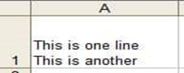
Sometimes you may want to add text in Excel that’s spread over multiple lines. Find out how to do this, or how to remove these, in this week’s blog by Happy trainer Ian Balboa.
Here you can find all of Happy’s blog posts, covering our Excel hints and tips, ideas for creating happy workplaces, and ways to be more productive at work — and more.

Sometimes you may want to add text in Excel that’s spread over multiple lines. Find out how to do this, or how to remove these, in this week’s blog by Happy trainer Ian Balboa.

Auto filter is a wonderful thing isn’t it? With a few clicks of the mouse little dropdowns appear letting you filter your data in a myriad different ways.

You’d think that there would be an AGE function that worked out how many years since the anniversary by passing in a date. However, life is not that easy. Our trainer Ian Balboa explains step-by-step how to calculate how many years since an anniversary – both the easy way and the hard way.

At Happy we talk a lot about how great Pivot Tables are — and Slicers make your Pivot Tables and reports even better. With Slicers, you can have one Pivot Table that switches between different categories through the click of a button. In this week's blog, Ian gives step-by-step instructions with how you can create your very first Slicer.
At Happy we have been developing e-learning for over 12 years. More recently we have got excited about Live Online Learning, where you learn from your desk but with a real live trainer in a virtual classroom. But some of the most effective learning we deliver still takes place in the classroom.

In this blog, Jonny explains how to use the LARGE Function to extract the top values in a row and even add them up.
How do I set my spread-sheet to automatically extract this month’s figure from the accounts?

Learn how to get your Pivot Table to put your filtered data on different sheets in Microsoft Excel with this blog.

Learn how to create simple Timeline filters that provide a slider type interactive filter.

What on earth has Florence Nightingale got to do with Excel? Florence Nightingale famously created a polar area diagram (a type of pie chart) in 1858 to show the cause of death in British military hospitals in the Crimean War. This highlighted the extent of preventable deaths (such as from typhus and cholera). The result was that the British government took action and commissioned Isambard Kingdom Brunel to design a new civilian hospital – reducing the death rate to just 1/10th of what it was before. This important use of data visualisation shows how powerful charts (and especially pie charts) can be.